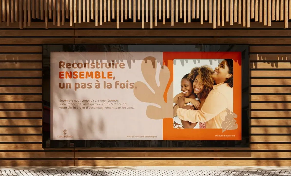
L’Arbre Fromager
A positive, human image for a nonprofit supporting women in French Guiana
The project
How do you make a nonprofit supporting women in French Guiana recognizable, with an image of support rather than stigma?
The challenge
A place of welcome and support, L’Arbre Fromager is a nonprofit that supports all women in French Guiana who are experiencing or have experienced domestic violence. For more than 20 years, it has been a go-to place for issues related to parenting, health, housing and employment.
To convey a positive image, one of closeness and humanity, the nonprofit needed a new look. The focus shifts to the support it provides rather than to stigma.
Objectives:
- build awareness;
- develop a positive image;
- become identifiable and well known.
The solution
What we delivered:
- logo redesign;
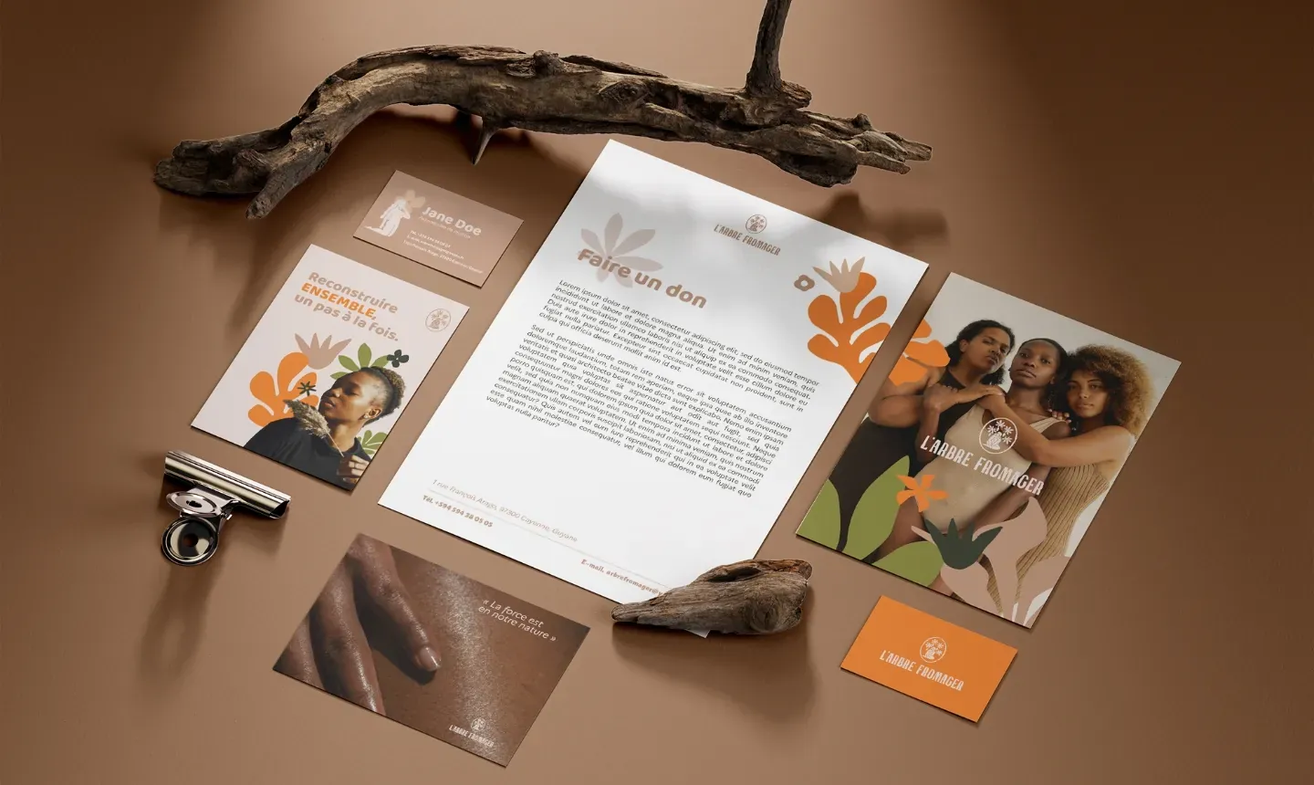
- brand identity;
- brand guidelines;
- brand strategy.
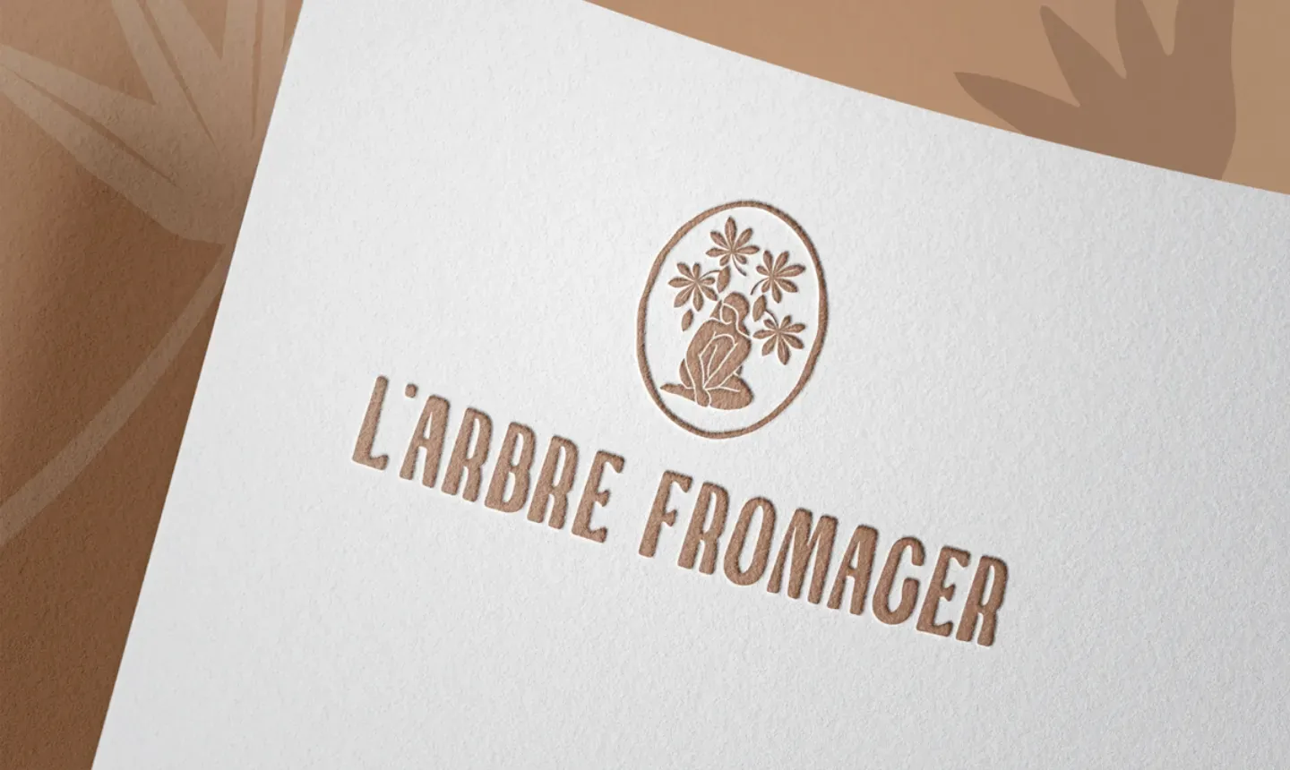
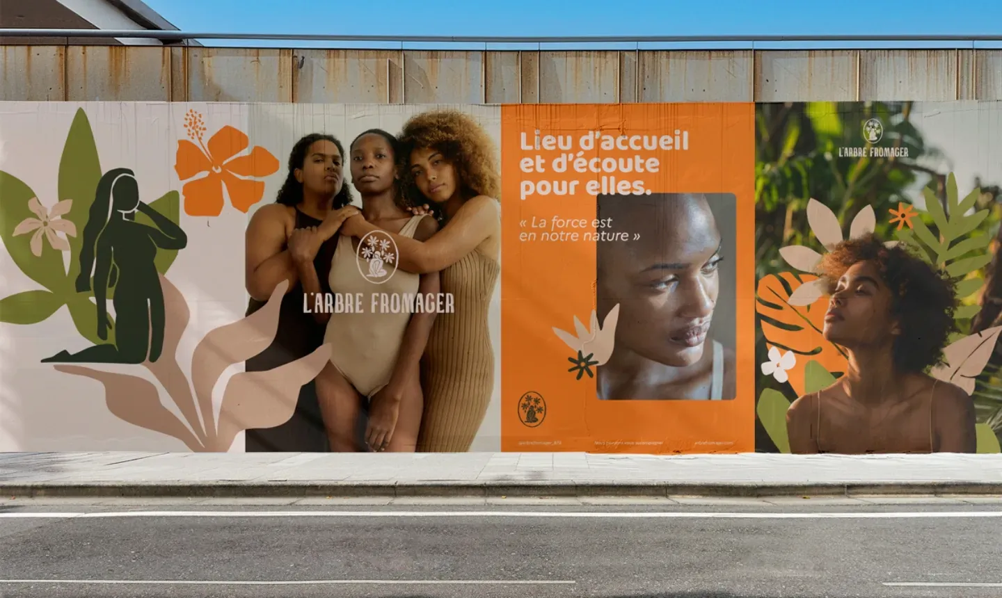
The logo plays with imperfect shapes that celebrate beauty and uniqueness. It depicts a woman inside a kapok pod, the fruit of the kapok tree (arbre fromager), a sacred tree in the French Caribbean. Like the women it represents, the logo is meant to be authentic and recognizable. The kapok leaves drawn around the silhouette recall the shape of the tree, evoking growth and rebirth, to celebrate the nonprofit’s positive stance.
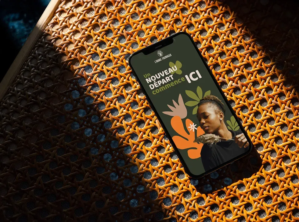
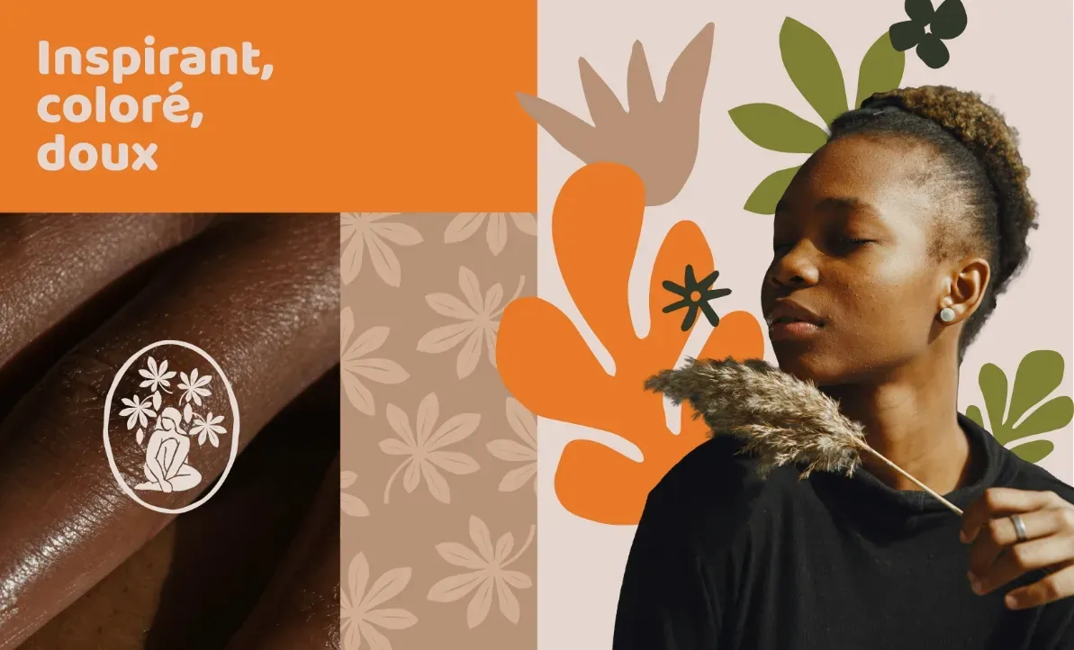
What if we focused on the future rather than the past? In its support work, L’Arbre Fromager always prioritizes the opportunities ahead for the women who come to it. In that spirit, we wanted to celebrate their positive influence on society, while recalling the timeless symbol of growth, resilience and renewal: the kapok tree. At the same time, to inspire trust, build connection and soothe, we chose bright yet soft colors, inspired by skin tones and the flora of French Guiana.
Gallery