Semop Agglo’Bus
Tailor-made branding to showcase mobility and public service in the Cayenne metro area
The project
How do you make people want to take the bus on the island of Cayenne, and handle the network’s communication with riders and staff alike?
The challenge
SEMOP AGGLO’BUS was created on October 1, 2020, succeeding the Régie Communautaire de Transport, which had run the network since 2012. The bus network has 8 lines connecting Cayenne, Rémire-Montjoly and part of Matoury, serving the vast majority of public facilities so that every rider can get around the island of Cayenne easily.
Making urban transit on the island of Cayenne more appealing and engaging for the people of French Guiana: that was our challenge. Imagining a visual world in harmony with the splendor of French Guiana’s landscapes, so that every trip becomes an invitation to travel.
Objectives:
- modernize;
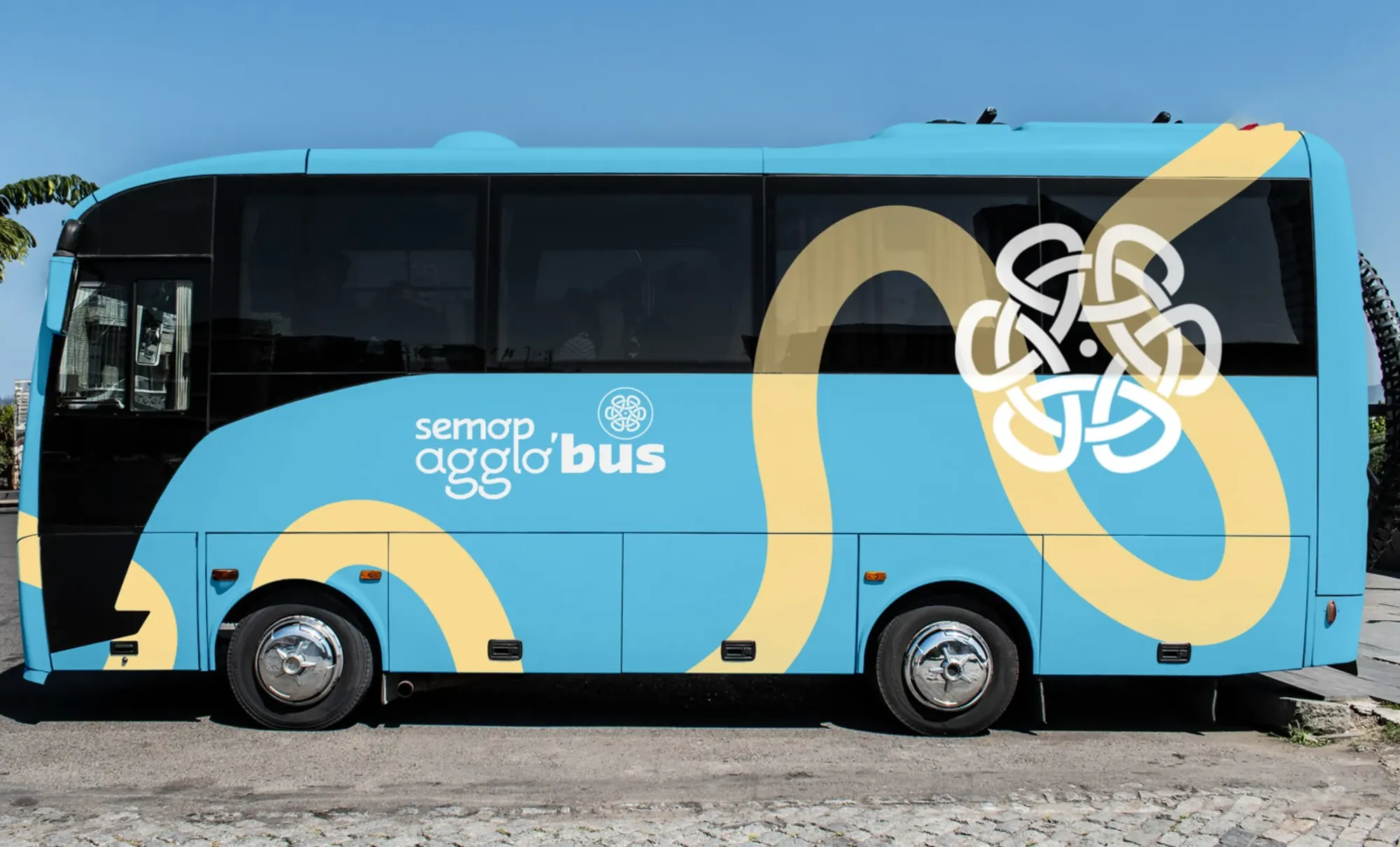
- make the buses more attractive;
- offer an engaging travel experience.
The solution
What we delivered:
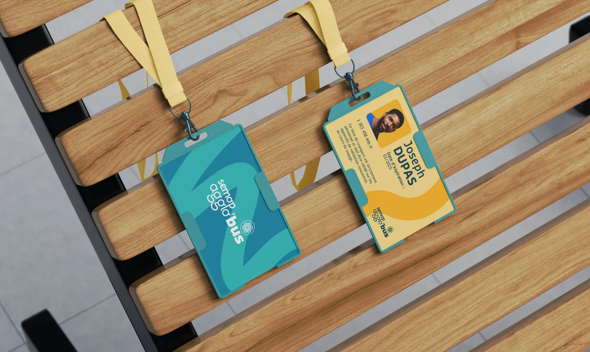
- brand identity;
- brand guidelines;
- brand strategy;
- communication campaigns for riders;
- internal communications.
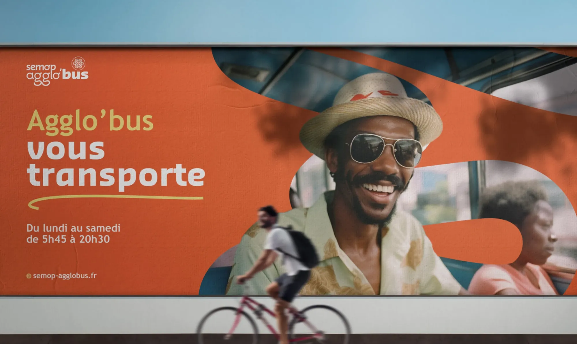
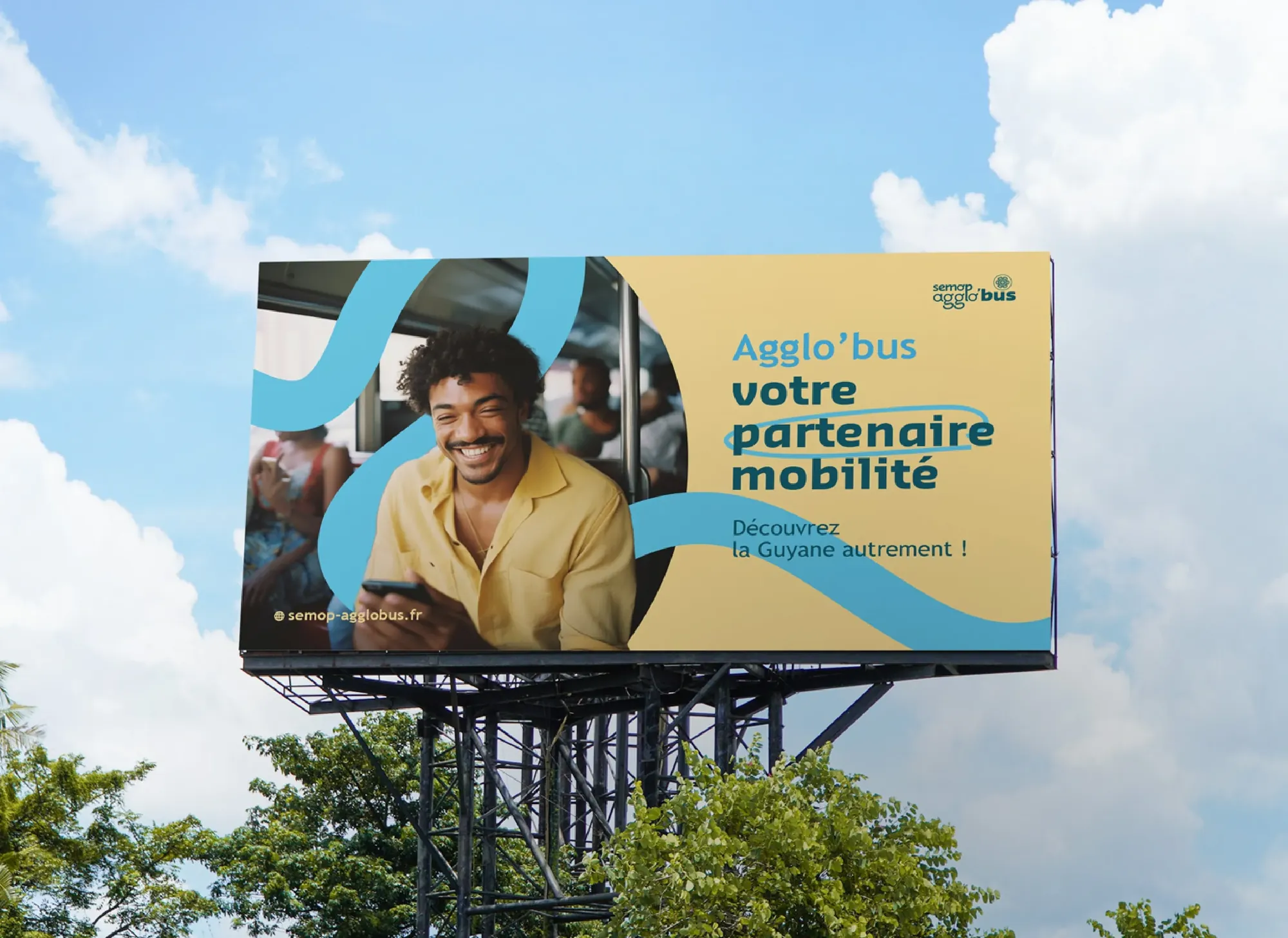
We wanted to create a visual world that doesn’t just carry riders, but invites them to rediscover French Guiana with every trip. Inspired by the richness and beauty of local landscapes, this new branding conveys the idea of a pleasant journey full of discoveries, while strengthening the link between the buses and their surroundings. The visual identity aims to make residents and visitors alike want to explore French Guiana with Semop Agglo’Bus, turning every trip into a unique visual and emotional experience.
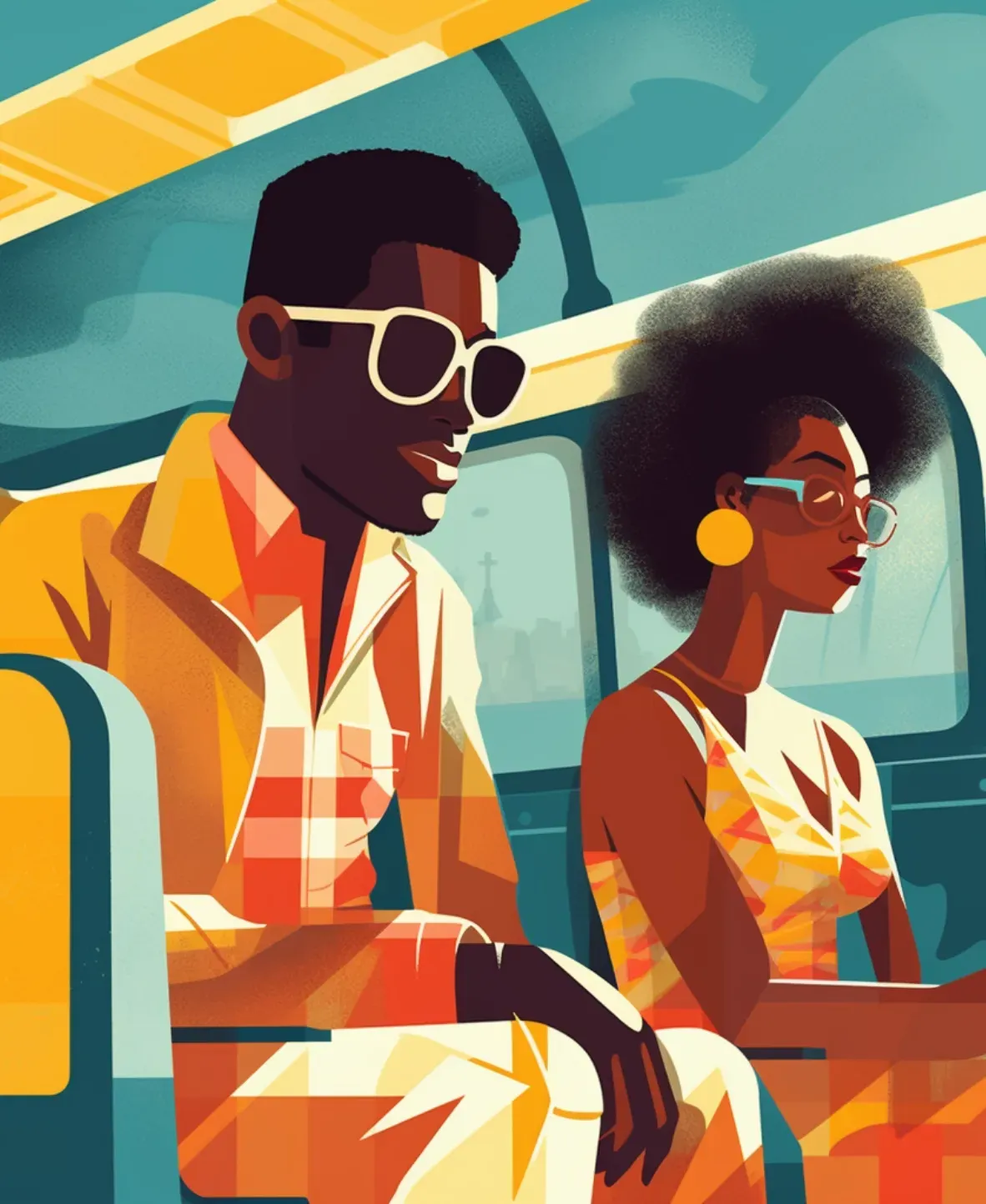
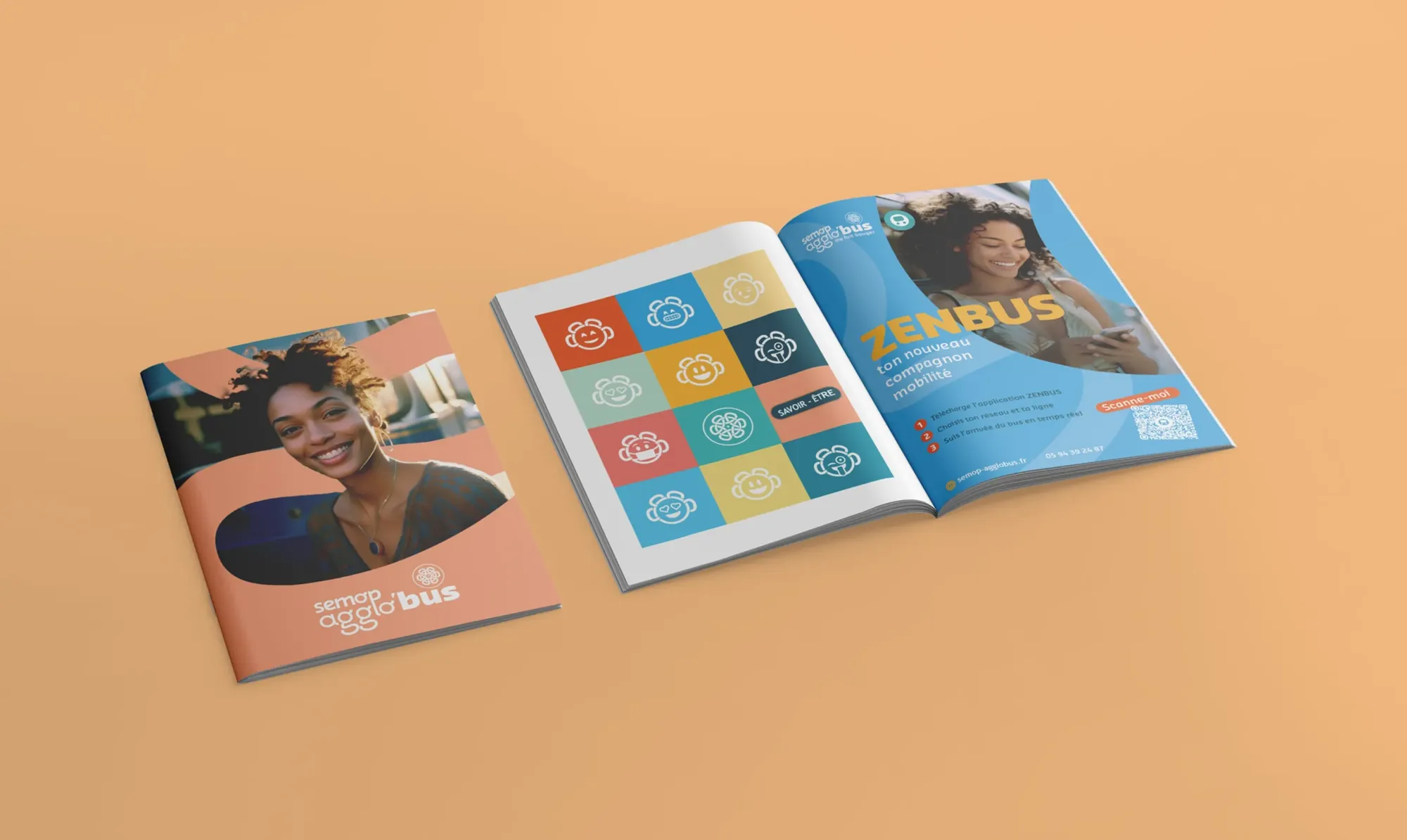
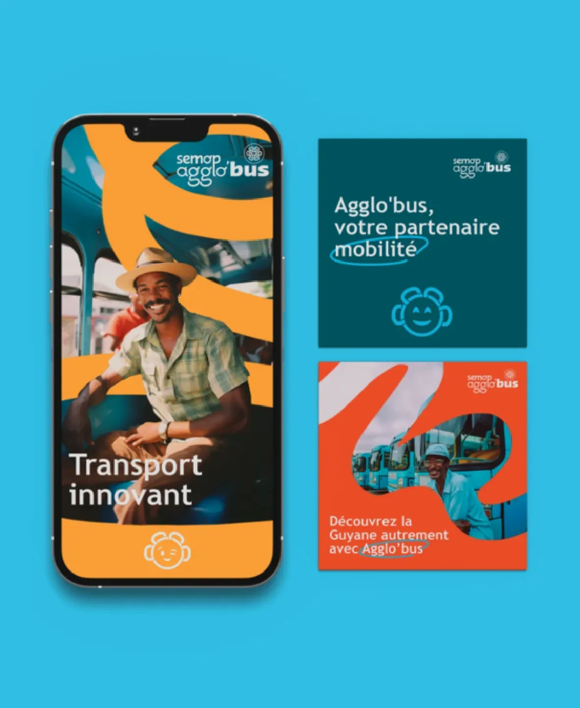
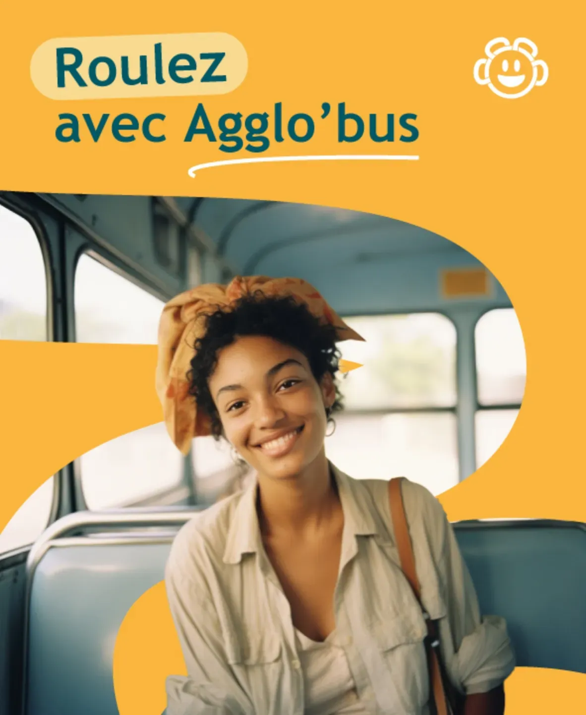
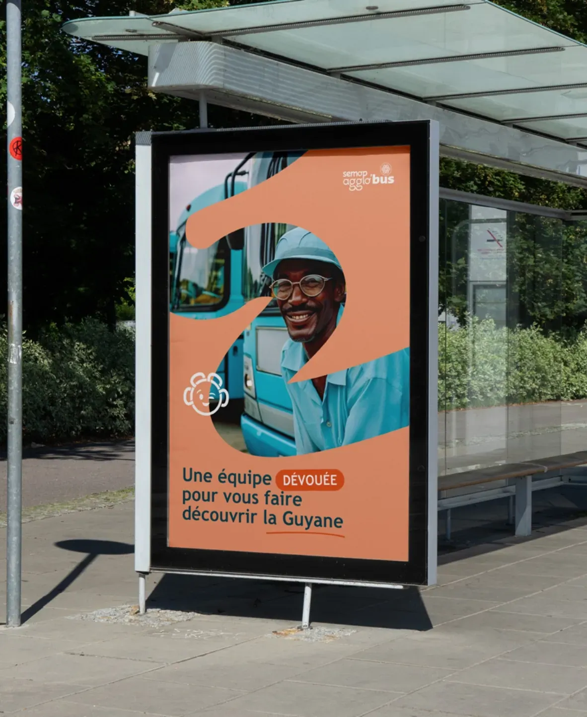
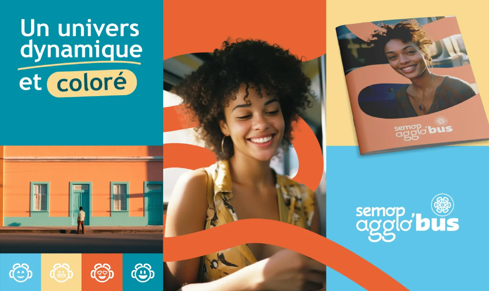
We designed a visual world deeply rooted in French Guiana’s identity, reflecting a brand image that is both lively and inclusive. Warm, energizing colors blend with shades of blue inspired by the Semop Agglo’Bus buses, creating a harmonious contrast that catches the eye. The typography, with its soft, welcoming curves, reinforces the accessible and playful character of the whole, reflecting an inclusive, caring approach. The iconography is built on hand-drawn lines that combine fluidity and bounce. These lines evoke the smooth movement of bus journeys, tracing routes with a light touch. Finally, the photography completes the identity with candid shots of passengers, smiling and immersed in their daily lives. These visuals let riders see themselves in the brand image and picture a pleasant travel experience connected to their reality.
Beyond the identity, we supported Semop Agglo’Bus over several years with 360 communications, helping manage its campaigns for riders as well as its internal communications.
Gallery